Today’s design trends tend to be more personalized, less trendy and more a reflection of people and their individual personalities. Today, in addition to the basics, homes are offices, classrooms and entertainment centers. Design trends are less formal, more eclectic, natural and sometimes less decorative and more minimalist. A desire for warm, comfortable, calm and casual tones are frequently the words shared when asked:
How do you want your space to feel?

More than ever in the history of design and style, color choices are important to achieving a desired feeling. Gray remains popular; it’s a timeless neutral. However, because of undertones and how they are affected by light, it can be a challenging color to choose. Greige is a warm gray that has undertones of taupe making easier to blend with golden oaks and wood trim. In bedrooms medium to dark blues, with gray undertones, helps create a relaxed calm and contented feeling that many homeowners want to achieve.
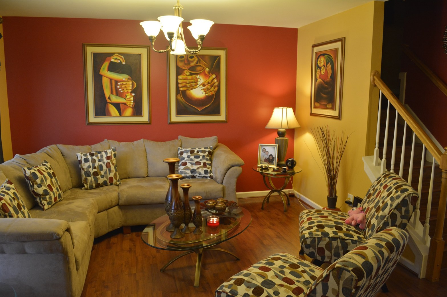
Earthy, natural tones are popular because they offer a feeling of casual comfort and outdoor relaxation. Colors like warm creams, deep greens, darker grays and combinations of blue and gray are examples of often-enjoyed earthy natural tones. These color tones can emphasize texture or an important design element like the stone of a fireplace. They can contribute to bringing an outside view in making it part of the room and an important focal point of the home.
“I like color. I’m not afraid to use color but everyone seems to be doing neutrals.”
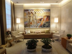
The idea of neutrals and one color throughout a given environment seems to be declining while the desire for “pops” of color is often an interest. Neutrals are important when it comes to choosing a primary color. A primary color is typically 60-65% of the space. This helps create flow and a background for other colors to be chosen and purposely distributed.
“Are accent walls dated?”
Accent walls are dated if it’s just a wall painted that has no purpose. For example, a wall with an interesting fireplace finish might be enhanced with a darker color or a bump-out wall, if treated differently, might offer a room dimension and keen interest. If there is not a specific purpose, accent walls are dated. Today, front doors are frequently painted with an accent color creating a sense of welcome for an entry area. Personal expression can be achieved when color is distributed proportionately and a neutral primary color is surrounded by a carefully selected palette of color.
“Should I explore a colorful kitchen space?”
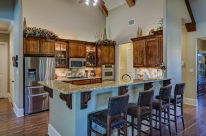
An exciting color and design trend is currently happening with kitchen cabinets. A few years ago updating kitchen cabinets met painting them white with an island painted a darker color. This may still be an excellent option but what seems to be a new trend is to have lower cabinets painted with a different color than the upper cabinets. Typically the lower cabinets are darker, grounding the base of the lower cabinets. A very sophisticated approach to kitchen cabinets is having a cabinet section treated differently than the other cabinets, maybe with a different shade of color. While a good option this has to be well thought out with balance and proportion in mind. Most often neutrals, especially gray tones, are used for cabinets that may have an undertone of blue or green giving a touch of color to the cabinets.
“Should colors matter when selling a home?”
Color and design adds comfort and personality to a space and is especially important when a home is being sold. The goal of good color choices and design is to create harmony and rhythm much like musicians create beautiful music. People may not always know how to create a well designed space but when searching for their new haven they will know how it makes them feel!
